META KINESIOLOGY
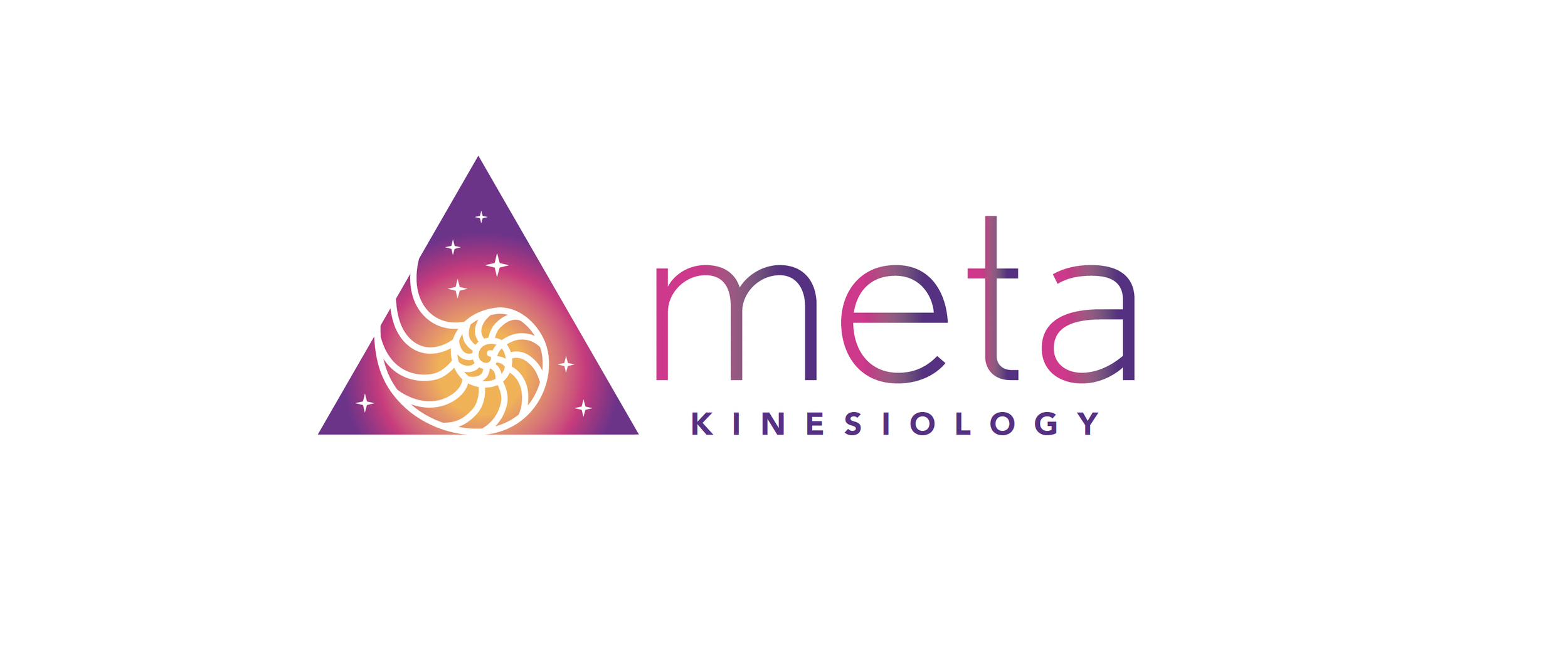
Founder of Meta Kinesiology, Leena has a deep connection with shells and a great love of the ocean. Leena chose the nautilus shell to reflect the spiral of life, transformation, introspection and expansion, listening to the voice within and the sense of home.
The logo embodies qualities in Leena’s kinesiology practice such as growth, letting go, surrender, gentleness, transformation, connection to the earth and divine universe. Key colours include sunset colours such as purples (crown chakra), pinks (heart chakra) and golds (creative chakra).
“Linda took a very holistic approach to designing my logo and, in particular, getting the small details and colours right. She was very patient with me and took the time to understand what my logo represents personally, as well as to my kinesiology practice. Linda gave me great advice on designs and colours. I wanted a nautilus logo that embodies transformation and metamorphosis. Linda’s design was modern, but at the same time it honoured the ancient traditions of my practice. I couldn’t be happier with Linda’s service.”
Leena Loicanno, Meta Kinesiology